
Does your training data paint a picture of progress or failure? Learn how to demonstrate the value of your learning programs by turning your data into storie

Every L&D professional’s ultimate goal is to improve the quality of training — ensuring performance change through learning programs that are linked to improved business results.
But more often than not, HR leaders don’t get the most ROI out of their efforts because the focus is on knowledge instead of performance outcomes. Training then becomes an information dump, and not something that produces valuable impact.
With this, questions like “Our employees got training, but why aren’t they improving?” and “Why are they still unable to do their work well even after taking learning courses?” arise.
Demonstrating the real impact of training doesn’t stop with just designing a program. It goes beyond that, measuring every stage of learning all the way from start to finish.
From here, you can take all the numbers and figures and use them in order to build a narrative of your entire learning program. This way, you can see what needs to be changed or retained, and ultimately, how to prove its impact.
Bringing data and metrics to life
Any great training program is one that is regularly and consistently evaluated.
When programs include healthy measurement practices such as reflection and feedback, it’s easier to communicate performance results effectively and follow learners on their journey to success.
This is why the metrics we get from our programs shouldn’t be set aside or put to waste, it should be leveraged to help you gauge just how effective your training really is. To know how to properly evaluate your training’s effectiveness, check out this article.
But many learning leaders, managers, and even trainers fear data, thinking it will somehow point to their work as less impressive. The reality, however, is that if we can measure something, we can make it better and, in turn, solidify with cold hard facts that our work made a difference.
After all, what we really want to figure out is whether all this training has produced results on-the-job.
To do that in a way that’s easy to understand not just for you but also for your stakeholders, consider bringing your metrics to life through data visualization.

Why visualize data
Data visualization, the graphical representation of information and data, is an “accessible way” to communicate trends, outliers, and patterns in data. This is made through the use of visual elements such as charts, graphs, and maps.
What’s so special about that is that it changes the way results are communicated.
In today’s data-saturated world, visualization is a very useful tool to make sense of the trillions of information generated every day. It helps tell stories by converting data into a form easier to understand — removing the noise and highlighting the useful information.
Think of it as moving past the typical stuff and going straight to what’s essential.
Instead of having to go over countless rows of statistics and going back to it time and again, why not take your time to understand it completely and make visuals to put things simpler?
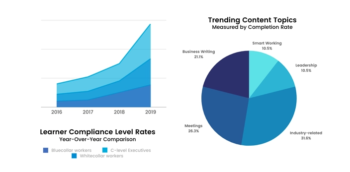
Do you have a handful of reports about the resources learners are usually consuming most? Then, make a pie chart presenting the topics and their average percentages. Don’t know what to do with the list of your learners’ level progressions? Then, compare the stats from before training has started and when it ended using a line graph.
The key here is taking all of those figures and presenting them in a way that allows you to see the bigger picture of your efforts. This is especially important when explaining all this information to your stakeholders.
By understanding how to display data in a way that is not only visually appealing but tells a compelling story that engages audiences and drives key messages home, learning leaders are better positioned to demonstrate business value and gain buy-in for their programs.
That’s because when they see the visible trends and patterns, the more they’ll be able to see the story behind the data. More than that, L&D will gain a seat at the table, because you can show clear, evidence-based results that are easy to digest.
Turning numbers into narratives
Now that you know why data visualization matters, it’s time to get into the “hows” of it. How can I start making my data visual? How should I go about choosing what to present?
Here’s a simple step-by-step guide to help you out:
Understand your data by setting goals
Searching through tons of data without a primary objective in mind can be overwhelming. This is why it’s important to determine your goal first so later on, you can tease out the story behind your numbers.
Answer the question “What story do I want to tell?”
Is it about improved performance and coordination of employees attributed to your training? Or maybe a learner’s journey to fostering better relationships with clients because of your language learning program?
Define what you want the narrative to be and work around that main goal by supporting it with the data you’ve collected or have yet to collect.
Determine what stood out and highlight them
Set the stage by asking “how does all this data fit into the bigger picture?”
Scan through all the data you’ve generated and filter out what’s valuable and what’s not. Do I care more about how many hours learners have spent on the platform or what content they interact with most?
Don’t be afraid to be picky when elevating and subduing data. When you are, only then can you start highlighting metrics that matter for your program and essentially get that message across.
Taking our first example from Step 1, you can show employees’ improved performance at work through assessments comparing their skill levels before and after training. Comparing the results, did you see the relation of their developed skills with how well they’re doing at work now?
As for fostering better relationships with clients because of your language training efforts, you can take customer/client feedback surveys and use that as supporting data.
Take your data and make them visual
After deciding on what data to keep, it’s high time to consider how to present them strategically. That means exploring different visualization techniques aside from the usual bar and line graphs. Remember: right information must be paired with the right set of visualization.
Would it be better to present trends by comparing sets of data on a monthly or yearly basis? Should content topics be shown in terms of consumption or completion rates? Should I merely list the skills employees developed by the end of the program or accompany them with percentages?
Here’s a list of some visualization methods you can use:
- Charts
- Tables
- Graphs
- Maps
- Infographics
- Diagrams
- Timelines
- Word Clouds
- Dot Distribution Map
- Gantt Chart
- Bullet Graph
- Heat Map
Stepping up your game, you can go beyond these methods and make your presentation even more visually appealing by changing scales and colors just as instructional designers do with learning courses.
Conclusion
At the end of the day, data visualization is a great way to share the metrics of your programs in a meaningful way. Not to mention, it gives you the ability to demonstrate impact on performance and influence the future of learning.
So before generating reports and crunching numbers, take these tips in mind as you build the narrative of your company-wide training with data.